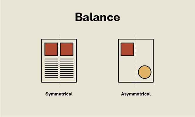
Any element on a page has a visual weight to it. It can be anything from the shape to the size, colour, and texture. The pieces of a design must have a specific scale in order for it to seem stable or balanced.
In a symmetrical design, for example, the items on the right side have the same visual weight as those on the left. Symmetrical patterns are easier to balance, but they can also be boring. Different sides of asymmetrical designs have equal visual weight. The ability to achieve asymmetrical balance can result in an aesthetically appealing design with movement.
Your design would feel weighty on one side and empty on the other if it lacked balance. When your design feels as if it’s falling off to one side, you know it’s out of balance.
Principles of Design: Unity
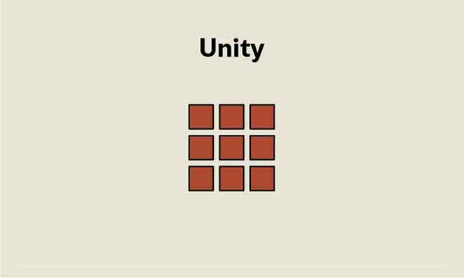
The harmony created by all of the aspects in a design piece is known as unity. Using comparable hues that complement and integrate pieces organically, for example, makes it appear as though they belong together rather than being thrown together on a page.
Making explicit relationships between visual elements might help you achieve cohesiveness. Wherever there is clear arrangement and order, there will be unity, and the elements of the page will not compete for attention. Instead, they’ll collaborate to strengthen the message. A design with too much homogeneity might become sterile and lack personality. That’s when you may start adding movement with other elements.
Your design would appear busy and confused if it lacked unity. Viewers will be drawn to the wrong part of the design, and the message will be lost. A solid rule of thumb is to only include something in your design if it adds to the message. Consider what the element contributes to the overall makeup.
Principles of Design: Contrast
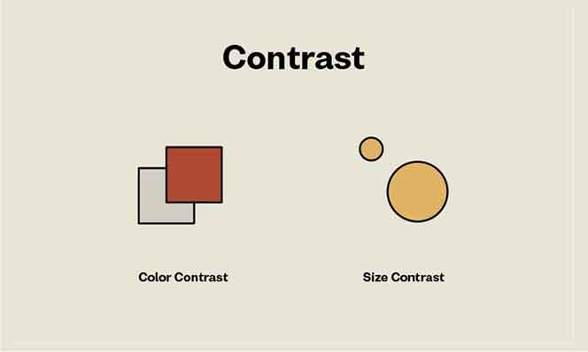
In order to build visual hierarchy, contrast refers to the degree of difference between design elements. Certain elements shine out more than others due to the variance. Colors, textures, sizes, and shapes can all be used to create contrast.
Contrast is used in a layout to create hierarchy between font sizes. Larger text is read first, followed by smaller text. When it comes to font pairing, contrast is crucial. In the sample below, we have a font pair consisting of a script typeface and a sans serif font. The script font gives the staid sans serif some movement.
Contrast can direct the viewer’s attention to select features by creating a focal point. By ensuring that elements are arranged evenly on a page, contrast may also be employed to create balance and harmony. A lack of contrast in a design might make it appear uninteresting, and visitors may miss the vital message. When designing accessible documents, contrast is extremely crucial. Black type on a white backdrop, for example, is easier to read than black type on a brown background.
Principles of Design: Emphasis
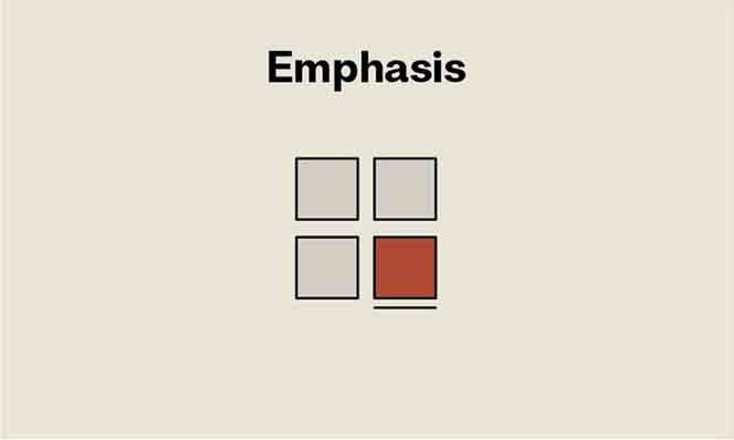
Emphasis is a technique for drawing a viewer’s attention to a particular design aspect. This can take many different forms, including a button, a webpage, or an image. The goal is to make something that stands out from the other content on the page. You can utilise a variety of elements to draw attention to a particular aspect of your design, such as lines, colour, positive/negative interactions, and so on. You’ll be able to establish emphasis as long as you can create contrast, whether with elements or colour.
- Shapescan also draw attention. Using a group of similar shapes and breaking the group with a different shape will create tension and draw the eyes.
- Colorcan create an emphasis in any design. Buttons on a website tend to contrast with the background to create a sense of urgency and attention.
- Texturecan be seen in materials to enhance tactile features. For instance, a business card can have an emboss or relief on a logo to emphasize it. Digitally, texture can be applied as a drop shadow on a button to appear three-dimensional.
- Spaceis also an option to emphasize certain elements in your design. Enough white space around an object can prioritize the focus on a single element. For instance, Apple has a clean and direct idea of emphasizing products.
Principles of Design: Repetition
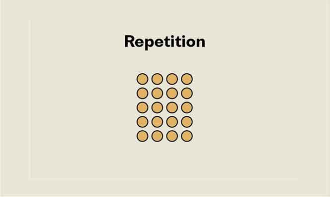
The use of repeating features on a layout might appeal to the eye. Repeating a single element throughout the design is known as repetition. A grid can be defined as the repetition of lines that creates a sense of consistency. In layout design, visitors can find their way around a book or magazine by repeating the folio positioning. The repeat is made more consistent by using the same folio placement.
Repetition can be found on a website in the menu placement, which provides users with a consistent positioning that might make them feel at ease and familiar. In a brand development project, repetition can also be done by repeating elements in a design, such as a logo or a tagline. The recurrence of waves below provides the impression that the page is limitless.
Principles of Design: Pattern
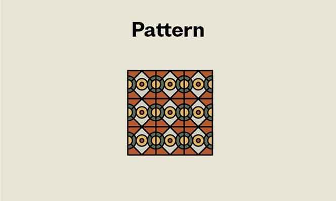
The repetition of more than one design element is known as a pattern. While repetition refers to the repeating of a single element, pattern refers to the repetition of numerous elements across a design (e.g. wallpapers and backgrounds).
Patterns can improve the viewer’s experience as well as the final design’s appearance.
The pattern in the example below repeats itself without any interruptions from edge to edge. Multiple components of various sizes and depths make up the design.
Principles of Design: Rhythm

The ideas of repetition and pattern are less difficult than rhythm. Throughout a design, repetition and pattern are applied to the same element. When a combination of elements is employed frequently and with variety, the visual tempo creates the impression of structured movement.
