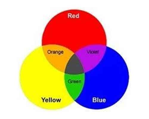
The primary hues are red, yellow, and blue. The most basic colors are primary colors. They can’t be made with any other colors. The secondary colors are orange, green, and purple. Two main colors are combined to create a secondary color. When you blend red with yellow, for example, you get orange.
The Color Wheel
A color wheel depicts the relationship between colors. Each secondary color is located between the primary colors that were used to create it on a color wheel. Because orange is formed by combining red and yellow, it falls somewhere between red and yellow. What’s the difference between secondary and primary colors? Intermediate, or tertiary, colors are created by combining a main color with a close-by secondary color. Intermediate hues include red-orange, yellow-orange, and yellow-green.
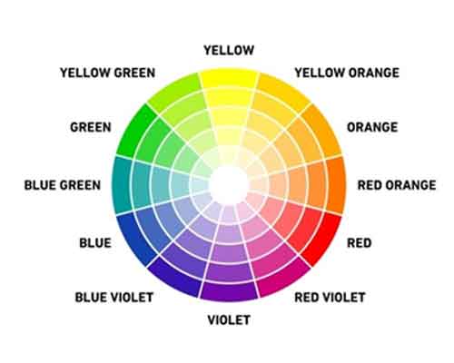
TRY IT OUT! Making a colour wheel is a great method to learn about colour theory. Start with primary colors like red, yellow, and blue. Make secondary colors with these. Then make tertiary colors by combining basic colors with secondary colors that are close by. (For example, you could get yellow-green by combining yellow and green, or yellow and orange by combining yellow and orange.)
Value: Tints and Shades
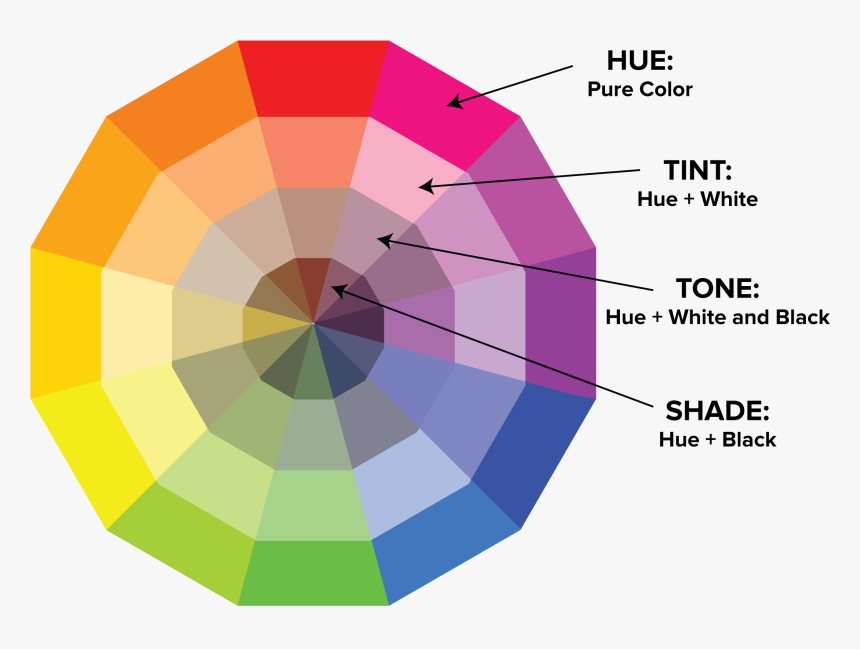
The lightness or darkness of a color is called its value.
You can find the values of a color by making its tints and shades.
Tints are light values that are made by mixing a color with white. For example, pink is a tint of red, and light blue is a tint of blue.
Shades are dark values that are made by mixing a color with black. Maroon is a shade of red, and navy is a shade of blue.
TRY IT! Start with some paint in your favorite color. Mix it with different amounts of white to make tints, and different amounts of black to make shades. Then try creating a picture or a design that uses all these tints and shades.
Complementary Colors
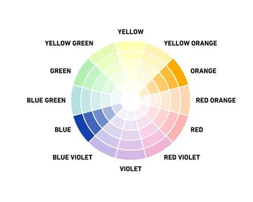
On the colour wheel, complementary hues are opposite each other. They tend to look especially alive when used together because they are polar opposites. When you combine complementary hues, each colour stands out more.
TRY IT OUT! Choose hues on the colour wheel that are diametrically opposed. You could, for example, go with blue and orange. Make a drawing that incorporates both colours. Isn’t it interesting how they contrast? This is due to the fact that the hues are diametrically opposed.
Analogous Colors
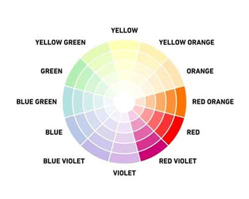
On the colour wheel, analogous hues are next to each other. Because they are so closely linked, they tend to look good together.
TRY IT OUT! Choose a primary and a secondary colour for your project. You could, for example, go with blue and green. Don’t they make a lovely couple? This is due to the fact that they are comparable. You can make even more comparable hues with only these two colours, right? blue-green, green-blue, and a variety of other colours in between. All of these will be the same colour: blue.
Neutral Colors
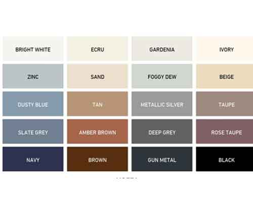
Neutral colors don’t usually show up on the color wheel. Neutral colors include black, white, gray, and sometimes brown and beige. They are sometimes called ?earth tones.? The popular color scheme typically consists of achromatic hues (white, grey, and black) along with near neutrals (beige, tan, brown, and other dark hues). All neutral colors have one thing in common: they are typically desaturated with the help of tints, tones, and shades.
TRY IT! There are a few different ways to make neutral colors. You can blend black and white to make gray. You can create brown in two ways?by blending two complementary colors together, or by blending all three primary colors together.
Warm Colors
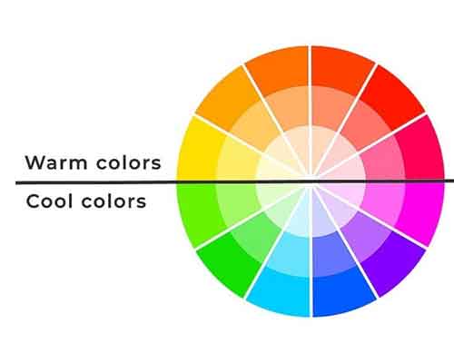
Warm colors are made with red, orange, yellow, or some combination of these. Warm colors tend to make you think of sunlight and warmth.
Cool Colors
Cool colors are made with blue, green, purple, or some combination of these. Cool colors might make you think of cool and peaceful things, like winter skies and still ponds.
